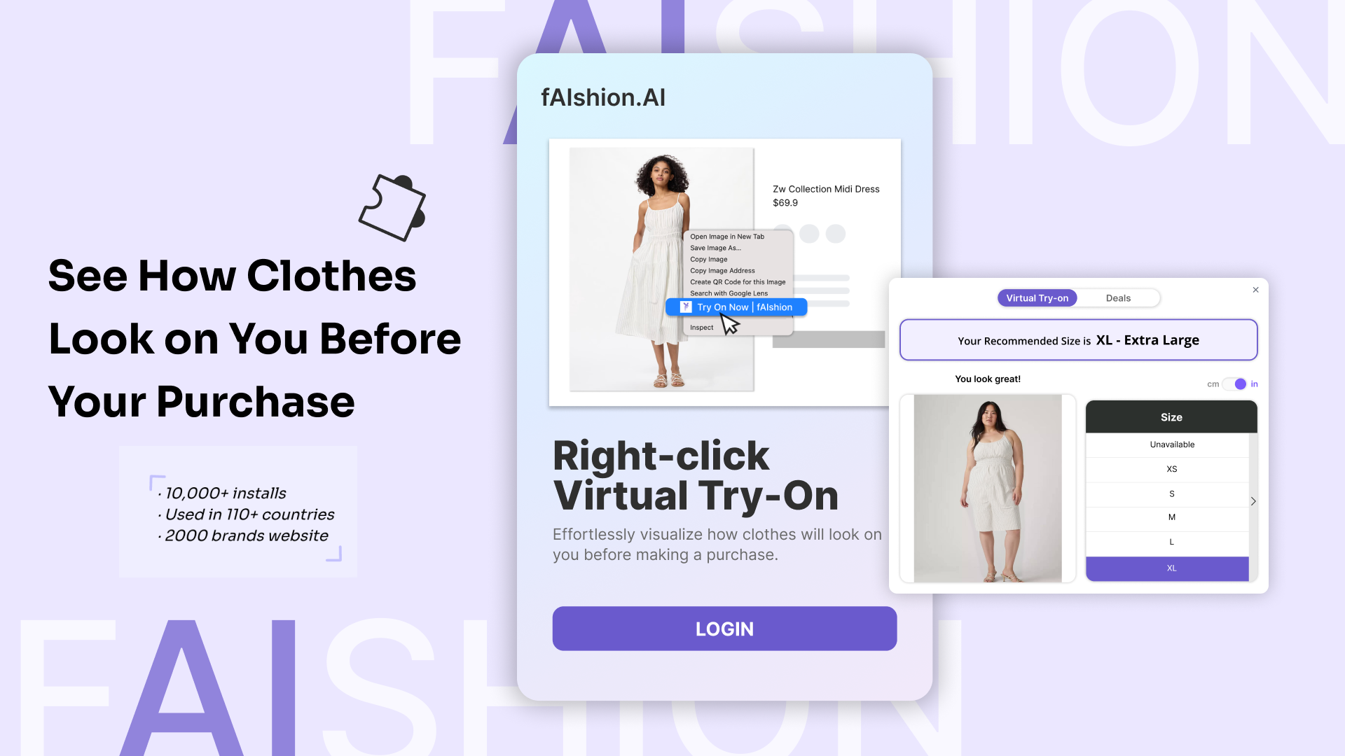
AI-powered Virtual Try-on Extension
Timeline:
2025.05 — 2025.8
My Role:
UX Designer & Researcher
Team:
CTO, CEO, Engineer, Designers, UX Researchers
Overview:
This Chrome Extension enables online shoppers to virtually try on garments and find the best fit size, creating a seamless online shopping experience by bridging the gap between digital browsing and physical fitting.
During my internship, I focused on enhancing the visual interface and user experience of the extension based on real user feedback. I redesigned the extension popup window, and introduced new features such as a built-in tutorial and a floating button for quick access. These updates not only improved usability but also strengthened the product’s user engagement.
How does our product support online shoppers' purchasing experience?
Our virtual try-on extension will let users upload photo to preview how garments look on their own body and know their best-fit size, which will affect online shoppers who struggle to make confident purchase decisions, by providing clear visual try-on results and accurate size guidance.
However, after the product launched and real users began interacting with it, their feedback revealed several frustrations that pointed us toward meaningful improvements.
What users are saying…
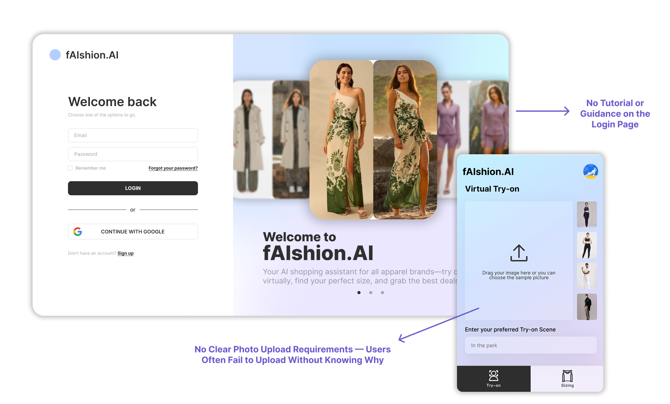
“I spent a long time trying to figure out the photo upload requirements as I keep failing to upload my photo without knowing why.”
“The size recommendation page feels overwhelming. I can’t quickly tell what my best size is.”
“I’m not sure how to open this extension tool. There’s no clear tutorial or guidance when I first use it.”
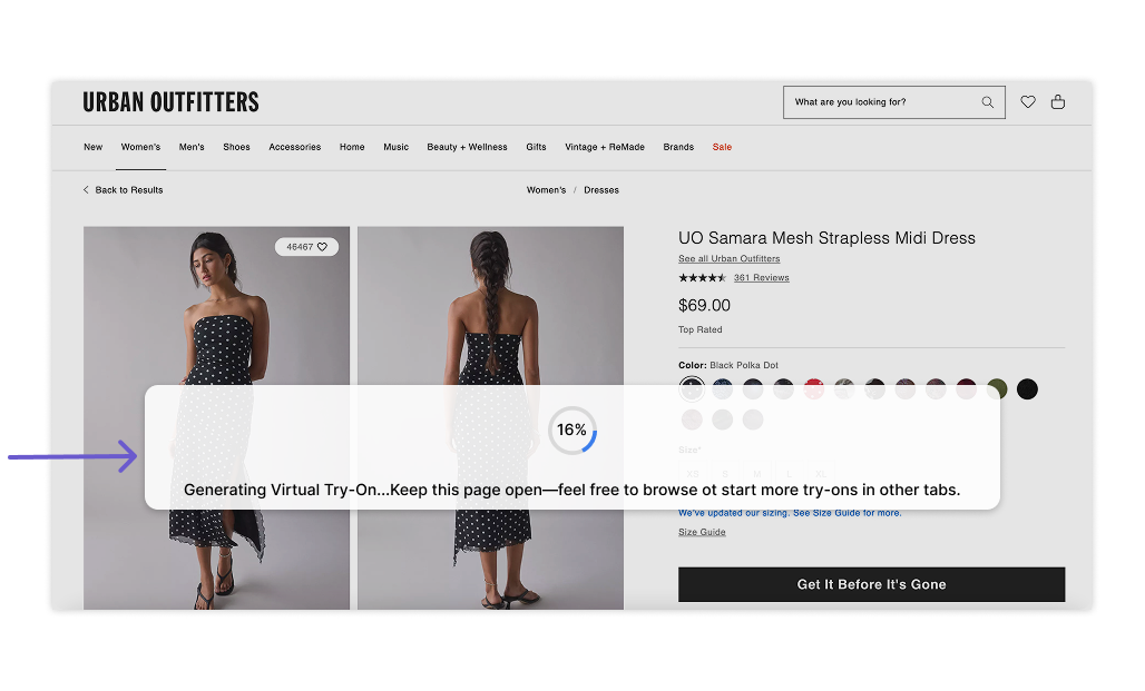
“The loading window doesn’t tell me how long it will take, so I’m unsure whether I should continue shopping or keep waiting on this page.”
“It takes too long to generate the try-on result, and I can’t close the popup while waiting. The process blocks my shopping flow, I’m stuck there until it finishes.”
“I don’t know where to access the try-on feature. The entry isn’t obvious.”
After reviewing these user pain points, we first mapped out the user flow to understand how users interact with the platform step by step. This helped us determine which parts of the interface needed improvement.
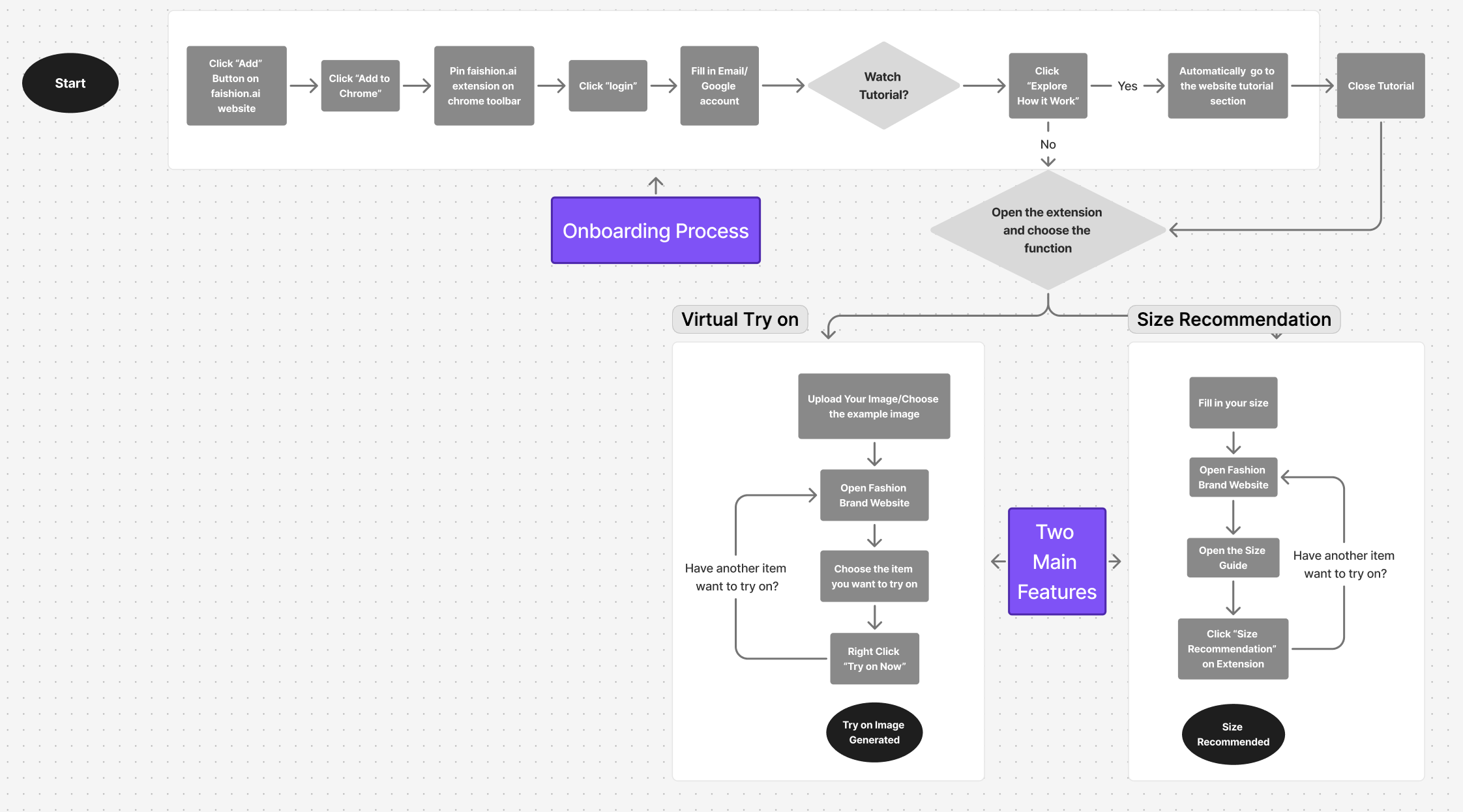
Then, we defined the following three problems as our main design direction.
01
03
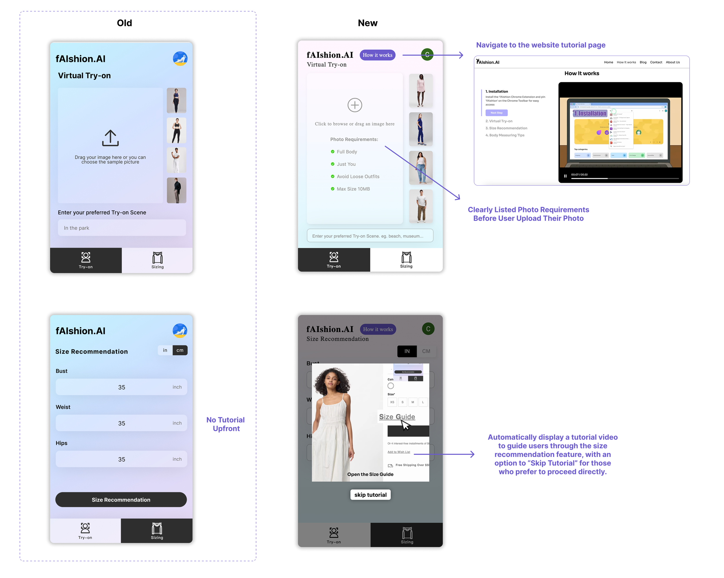
No Clear Tutorial
Problem:
Most users feel confused when using the fAIshion extension for the first time, as there is no clear instruction or guide on the login/onboarding page. To understand how it works, they must manually open the website to view the step-by-step tutorial.
Opportunity:
Place an auto-playing tutorial that introduces the main features and instructional steps before using the extension, helping users quickly understand how to use it and improving the overall onboarding experience.
Cannot Close/Minimize the Popup Window
Problem
Users cannot close the popup loading window while generating the try on image, which makes it less user friendly and interrupts users’ shopping flow.
Opportunity
Add a close or minimize button to let users freely control their interaction flow. Additionally, provide an option to reopen the popup if users want to check their progress at any time.
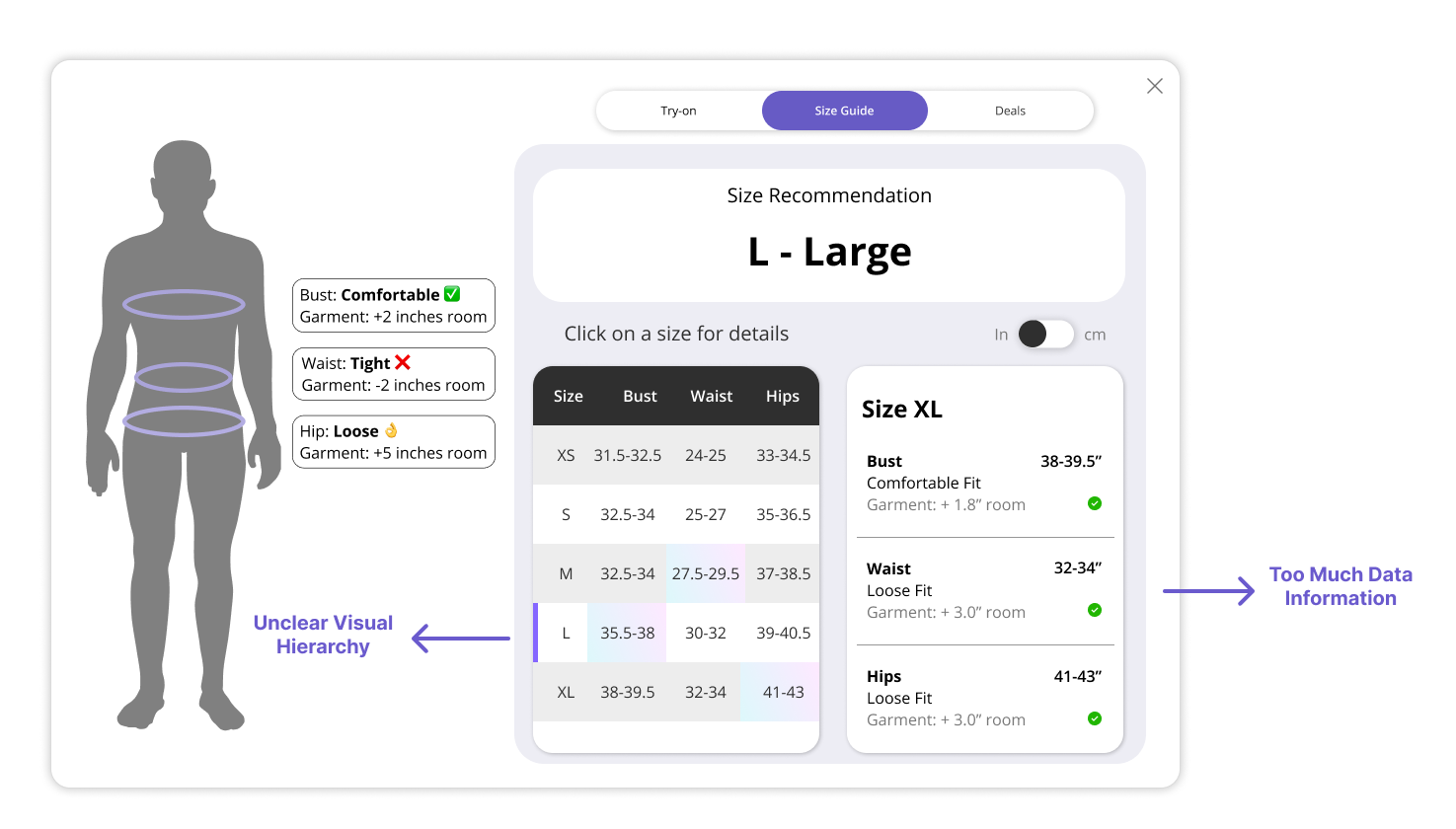
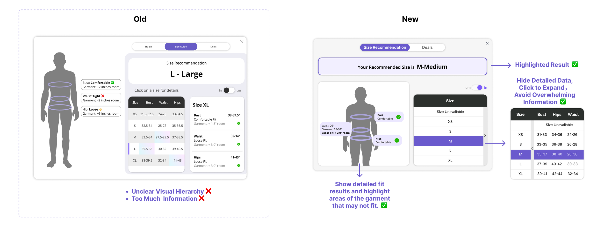
Too Much Information on Size Recommendation Page
Problem:
The size recommendation section contains too much information with unclear visual hierarchy. The crowded layout and repetitive data make it difficult for users to quickly identify the most important information.
Opportunity:
Simplify the content and refine the visual hierarchy by reducing clutter and redundant details. A cleaner layout with clear emphasis will help users easily focus on key insights.
02
Do we solve the above user pain points on our design?
Tutorial Guidance
Goal Statement: The redesign aims to provide an intuitive, step-by-step tutorial that guides users before their first use, enabling them to quickly understand our key features and functions.
01
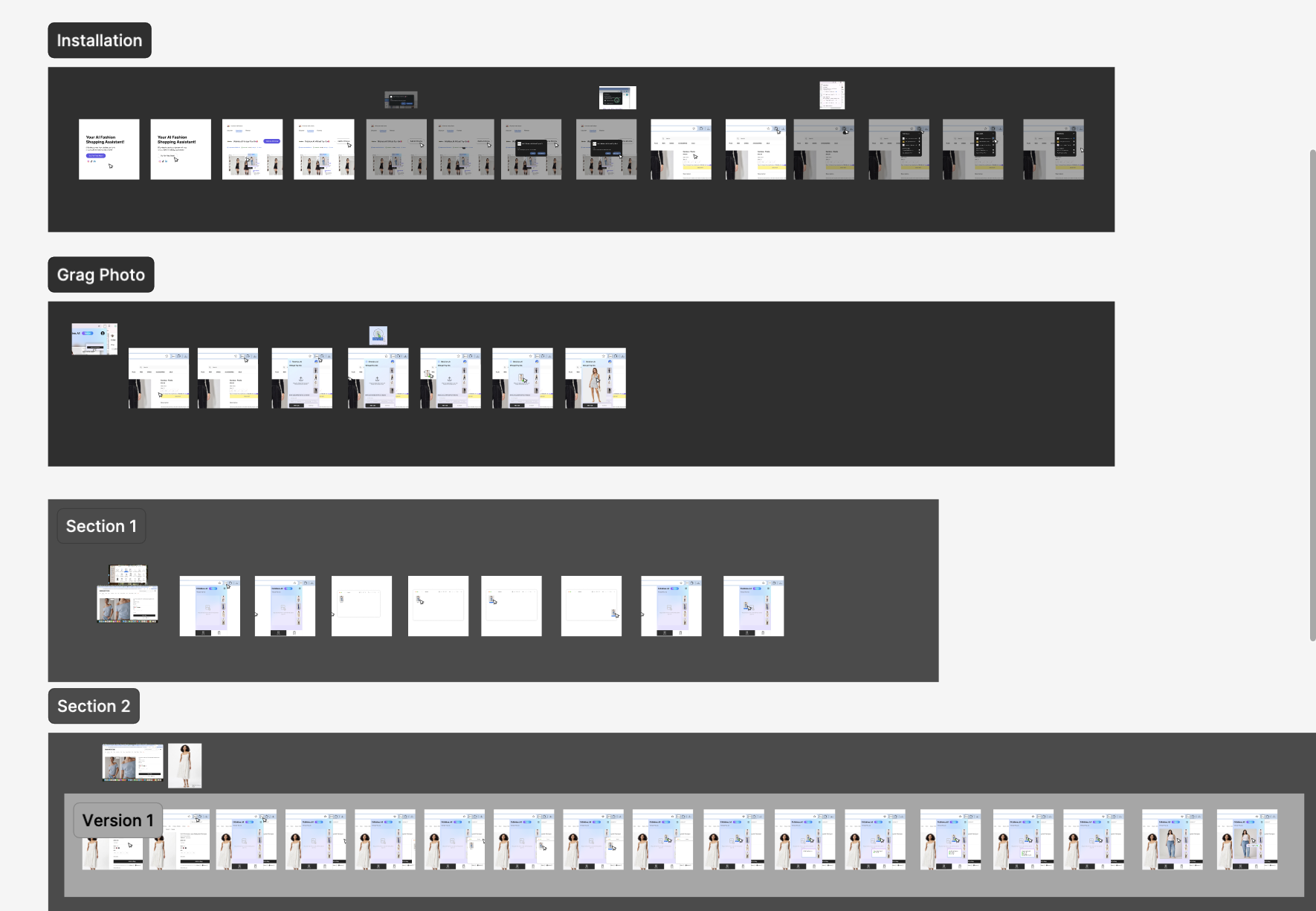
Step 1: How to install?
Built-in Tutorial
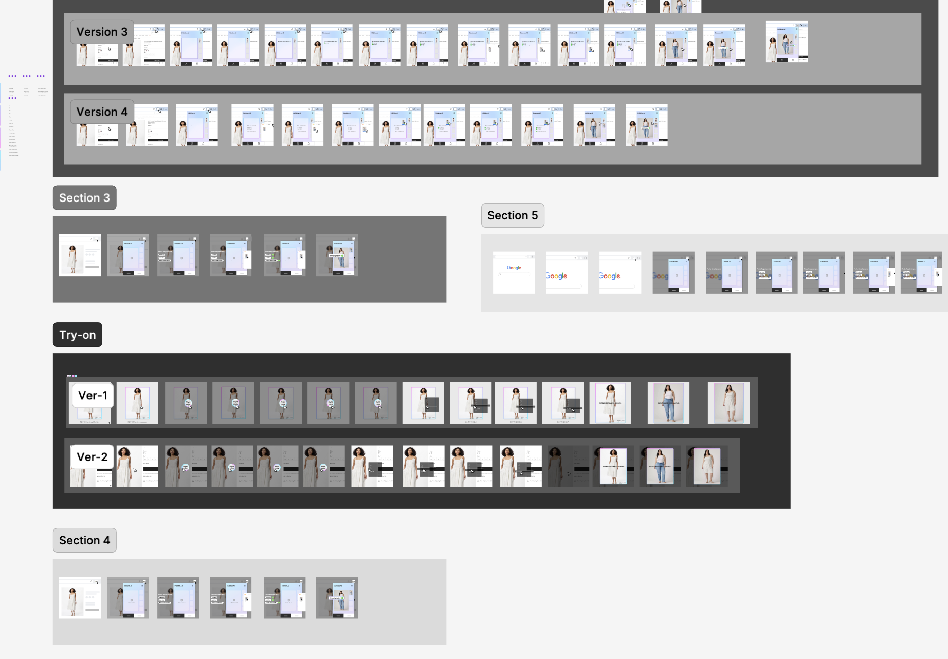
Figma Design Sketch
02
Visual Hierarchy & Highlight Key Results
Goal Statement: The redesign aims to enhance visual hierarchy and clarity to help users easily identify their most suitable size and understand which parts of the garment may fit slightly smaller or larger.
03
Step 2: How to use Virtual Try-on?
Popup Interaction Flexibility
Goal Statement: The redesign aims to make the interaction more user-friendly by allowing users to close or minimize the popup window during the loading process.
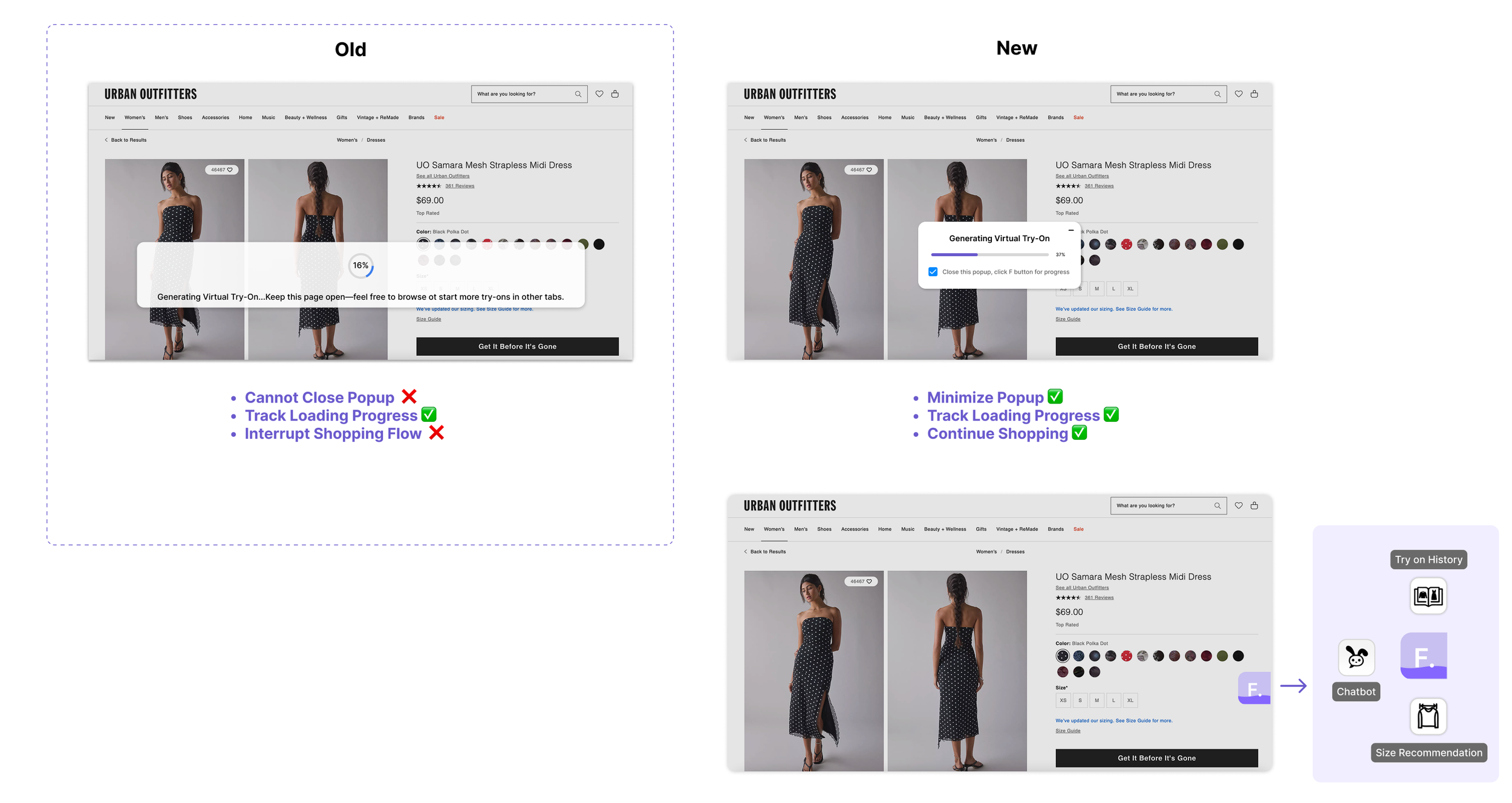
When minimized, it will turn into a small floating “F” button, enabling users to continue shopping while easily checking their progress whenever they wish. And user can hover the “F” button to access the other three features.
What I learned from this project…
“Visual hierarchy is not only about aesthetics — it’s a language that helps users think less and feel more confident.”
“Building a more flexible interaction flow reminded me that empathy is the foundation of design — understanding when users need space and when they need guidance.”
Explore More

Illustration
A collection of my commercial and personal illustration work that showcases my ability to blend traditional techniques with digital painting.
Branding Graphic Design
A school project focused on developing brand visual identity — including banner, flyer and product design — for a nonprofit organization.
Web UI/UX Design
An internship project focused on building UI platforms and CRM tools that help home-service professionals manage their projects and client relationships more efficiently.